0

Funny sort-of Valentine – Tim Holtz February Tag

When I was in college, my friends and I were part of the medieval club. And in someone’s strange humor, Valentine’s day was dubbed “Gargoyle Day”. As I recall it, regardless of dating status we celebrated with break-up comedy movies, chocolate, and gargoyle crafts. There was also a “Black & White Ball” around mid-February as an official club activity which involved modern formal apparel and medieval-style group dances. Yeah, I’m a big nerd, I own this.

Gargoyle Day and the Black & White Ball were my favorite versions of Valentine’s Day. I didn’t mind the kiddie version of passing Valentine’s to every fellow student and making our own mailboxes. And I remember my parents giving me candy and toys. But I guess I don’t remember seeing big romantic displays of chocolates and roses. If my parents did a romantic dinner or something, either I didn’t know, or it didn’t make an impression on me. I do remember them showing each other love and kindness all along the way, and making time for each other on a regular basis.

So in my own dating life, I’ve voted for regular displays of affection over big romantic gestures. Don’t get me wrong, I like the opportunities for creativity inspired by every holiday. And I’m impressed by the romantic efforts other people go to for their loved ones. And maybe, just maybe I’m looking forward to making pink heart-shaped pancakes and other silly gestures for my little boy in a few years. But otherwise, Valentine’s Day just isn’t my holiday.

So that’s a long preamble for my take on the February Tim Holtz tag. But I felt the gargoyle required some serious explanation! I loved the look of his background of embossed hearts that call to mind vintage enameled heart jewelry. I loved the little Industrial sticker details. I’m not sold on the popular chalkboard look, yet. Maybe it will grab my imagination at some point, but for now I’m skipping that technique.

So then the other thing this Gargoyle Day tag needed was a gargoyle! I drew a gargoyle as Cupid, colored it with Distress markers, and pinked up the edges of the circle diecut with Distress ink.

20140216-202340.jpg

Ingredients: Watercolor paper, #8 Manila tag, Industrial border stickers, Distress markers, Distress ink pads, Sizzix Movers & Shapers hearts, Distress rock candy glitter, Seasonal chitchat stickers, Sizzix decorative strip ticket die, Grunge board, Stampers Anonymous Odds & Ends stamp, glitter glue, foil tape

Learning: I feel like I barely squeeked by with the hearts. I had cut them last month from foil-covered Grunge board that was left from the previous tag. I had hoped that I could cover them with red glitter glue and have a cool, mirrored, slightly glittery surface, but I had trouble getting good coverage with the glitter glue. So then I tried to cover with Distress glitter and go with the technique in Tim’s tag tutorial, but I should have just pulled off the foil or removed the glitter glue to switch Glossy Accents, because the glitter glue didn’t hold the glitter on very well when I inked it. Glossy Accents seems to be a really strong adhesive. I did like how easily the Distress glitter dyed with the Distress ink – that is a good trick to remember!

Something I tried with much more success was masking off part of a stamp. I don’t know if other people do this, and maybe there is a better way, but this is the method I came up with. I used bits of painter’s tape to mask off a section of the stamp I didn’t want to print, inked the stamp, pulled off the tape and stamped it. This gave me a nice blank space to scrawl “Gargoyle Day” instead of Valentine’s day.
20140216-204906.jpg
My lettering on the ticket is kind of primitive, and I like to think that my gargoyle was taking over Valentine’s day, like maybe Cupid needed a day off or something. I think I could have pushed that idea a little more, but I didn’t have any other ideas.

Loving: I may have said this before, but I really like how the Odds & Ends stamps go with the Ticket Strip die. It’s just really cool to stamp a custom ticket, and I’m getting a lot of mileage from the concept.

I like the background every bit as much as I imagined, and despite the minor glitter losses I like how the Grunge board hearts came out. I like my gargoyle Cupid too, at least conceptually. I still haven’t decided if I like my “cartooning” style. But that is an issue for a different time.

2

The gears are meshing

For my father-in-law’s birthday card, I knew I wanted to include florals, because he’s a gardener. But I also wanted to make sure it was a bit masculine in colors. Since he’s a machinist, tinkerer, and inventor, I thought I might include some steampunky gears.

This week’s Flouishes Timeless Tuesday challenge was to use a non-rectangular shape. I don’t yet have any large dies for base layers of cards, so I had to improvise a bit.

I had an embossed, sanded and shimmer ink-sprayed piece of Core’dinations shatter card stock that I had done as my very first embossing experiment. That became my base, and it thought that the Tim Holtz Picture Wheel die would both reflect both the embossed gear shapes and the overall rounded shape that I wanted to use.

I really enjoyed watercoloring the stamping with Distress markers. It worked so well that I’ve decided to invest in the whole set eventually, so that I can watercolor on lunch breaks or on the couch. While it’s certainly possible to color, as I have been doing, with the Distress ink pads, a brush and some water, the markers are way more convenient and portable. I just hope that the water brush markers work as well as using a regular wet brush. We’ll see!

I’d like to try the alcohol inks like Copics or similar down the road, because of their broader range of colors, but right now I don’t need to invest in a whole separate technique because there is so much to explore in the world of water-reactive inks. Besides, I’ve always been drawn to watercoloring.

20140111-192720.jpg

Ingredients: Watercolor paper, Core’dinations Shatter card stock embossed with a Darice folder and sanded, flowers and sentiments from Flourishes (Passion flower and Tag Lines), Distress markers, Distress ink, Archival ink, Tattered Angels Glimmer Mist sprays

20140112-131704.jpg

Learning: I really need some better ways to cut a shaped card base. I drew guidelines and everything, but I simply could not cut a curve smooth enough for my satisfaction. Fortunately the recipient was more excited about the flowers and the gears – which lead to us experimenting with die cutting and embossing his basswood scraps – fun!

Given all the trouble I’ve had with Distress ink on acrylic clear stamps, I was very pleased to find that Distress inks and markers worked so well on Flourishes’ photopolymer stamps. I had fun blending colors using a Distress marker directly on the stamp for the inside of the card.

Loving: I loved the finished colors, the strong browns contrasted with the rich purple. I loved the way the picture wheel shows little peeks of the background. And I was delighted to find a use for the picture wheel die which I think I picked up as part of a lot. I was also happy to have finally found a use for the embossed gears sample I had made a couple of months ago.

1

A lady of mystery

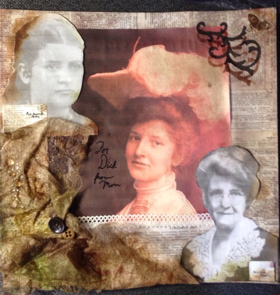
There’s a lot I don’t know about my mom’s side of the family because I lost her when I was a preteen, before family history sounded interesting.

Since I’ve had my baby, I have been on a mission to dig up more info on my mom’s side to add to my son’s baby book, and then later start a more comprehensive book of family history for myself. Ancestry.com has been a big help for names, dates and places, but I often wish I had more backstory. I have a few picture from a box of my mom’s old things as well. Some are marked, and others aren’t.

So when I saw that the challenge for the Simon Says Stamp Monday Challenge blog was “It’s a Mystery“, I immediately thought of my puzzlement over some of the photos in the box. I had posted some on Facebook and had heard back from older relatives about one. Another was marked on the back, but it was from far enough back that I wondered why someone had done a portrait photograph of the teenage girl because solo photos of children seemed a bit uncommon back then. The third was of an incredibly elegant woman, with only the inscription on the back “For Dick from Mom” to guide me. Based on the fact that the older elegant woman looks similar to the younger elegant woman, and the fact that this woman had a son named “Richard”, I’m going to guess that they are one and the same.

20131124-143903.jpg
Therefore, I believe that these three pictures are younger and older pictures of my great grandmother, and a picture of her mother as a young girl. But who knows for certain?

Ingredients: Sizzix movers & shapers flourish die, Crowded Attic Salvage stickers, rhinestones from Recollections, buttons from stash, lace from stash, Distress inks, Tattered Angels Glimmer Mists, Emboss It! Pen in black, Ranger super fine embossing powder.

Mysterious ingredient: dryer sheets

0

Game time ATC

Once again, I wasn’t fast enough to make the Wicked Wednesday ATC challenge. At least this time I knew I wouldn’t make the deadline. I think I should plan to work a day ahead for these challenges, because trying to make it happen immediately after work isn’t realistic.

I did play along anyway though, even though I am too late to link again. The challenge was “Anything Goes”, and I decided to make mine gaming themed for future inclusion in a scrapbook page about my other hobby: gaming (board games, card games, RPGs).

20131119-221732.jpg

Ingredients: Core’dinations card stock, Distress inks, Sizzix ATC & corners die, Holtz Card Faces texture trades embossing folder, Seasonal Chit Chat stickers, old button from stash

Methods: Using two colors of card stock, I did one inking the debossed side of the embossing folder, and one inking the embossing side. I was initially hoping for a crisper image over which to use some grunge stamps, but the card stock was toothier than anticipated so further grunging wasn’t necessary.

As much as it was delightful to have a perfect sized embossing folder for an ATC, I wonder how much use I will find for the card face embossing folders. Even as a gamer, they seem a bit limiting to me for use as a texture. Kind of too symbolically loaded.

1

Simon says Simple

For my second ever challenge blog entry, my inspiration challenge came from the Simon Says Stamp Wednesday Challenge Blog. I’m not sure why they support two challenge blogs, but I’m delighted that they do. Monday is for the vintage, antiqued style while Wednesday is for a modern, fresh look. I think they’ll accept entries of all stripes, but I suspect the challenges lend themselves to either look. I think of it as Tim Holtz vs. Martha Stewart, two aesthetics I admire, so I’m happy to experiment on either side as time allows.

This week’s challenge is “Keep it Clean & Simple“.

20131110-230647.jpg

I embossed another of those clearance pearlescent A2 sized white cards (David Tutera, I think) with a Sissix folder called Alpine Flowers, and added a die cut “Holly & Berries 6”. The die cut was washed with a little diluted “Walnut Stain” Distress ink, and later I added some red acrylic paint for the berries. I love the result, very elegant. However, since the embossing folder and die came together in a set, I’m not sure this represents the most out-of-the-box creative thinking. I mean there wasn’t a picture of them used together, I just really doubt I’m doing something unique here. Oh well. At least I succeeded at my goal of being able to enter another challenge and complete another card.

Until next time, keep those stamps inky…