1

Alethiometer – January 2014 Tim Holtz tag

My husband and I recently finished reading the His Dark Materials trilogy. In these fantasy young adult fiction books, a spunky young girl gets into all manner of adventures across many worlds and is helped along by friends and a marvelous “truth-teller” device called an Alethiometer (aka a golden compass, but don’t bother with the movie of that name because they really muffed it).

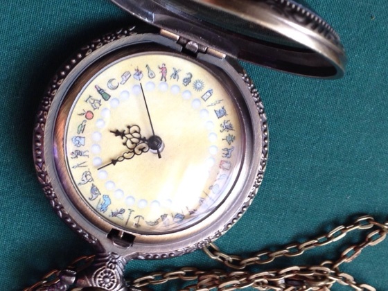
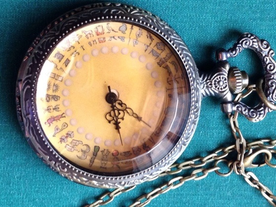
So when I saw the January 2014 Tim Holtz tag with the “pocket watch” die, my mind traveled to a pocket watch version of the Alethiometer that I made him for the holidays.

20140131-210850.jpg
I dissected a pocket watch and attached a printout that I had carefully sized and sealed to the watch face.

It turned out really well, and still works as a watch, even!

20140131-211313.jpg

But when I made it, I regretted that I didn’t have time to draw the many symbols myself. I just got the imagery from the internet and combined with some pearl inlays I had created previously in photoshop for a different project.

20140131-211651.jpg

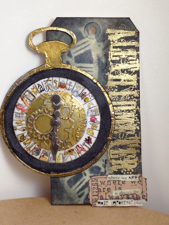
So I thought it would be great to use the pocket watch die to make an Alethiometer of a size where I could draw the symbols in for myself. Otherwise, I followed much of Mr. Holtz’ tutorial for the pocket watch and the background.

20140131-212406.jpg

Ingredients: Manila tag size 8, Sizzix Frame Pocket Watch die, Sizzix Alterations Circles, Super fine gold embossing powder, Glossy Accents, Sizzix tickets decorative strip die, Tim Holtz clockwork stencil, Holtz Grunge alpha stamp, Distress inks and markers, Martha Stewart lettering stamps, Stampers Anonymous Odds and Ends, Archival ink, Idea-ology game spinners, Micron pen, Darice embossing folder, Grunge board, Tarnished Brass Distress paint, and some words I printed. Whew!!

Learning: I screwed up the count on this. For some reason I thought there were 32 symbols, but by the time I got to drawing to the last few symbols, I realized that there were supposed to be 36! Oops! At the same time, I don’t think 36 would have worked out proportionally. It was hard enough to draw in those tiny spaces as it was!

My other mistake was that I had the foil side facing up when I went to cut the pocket watch. So I had to flip it and reroll it in order to get that impressed inner rim. This made the whole thing a bit more fragile, so I backed it all with a diecut piece of paper.

Loving: Grunge board was really fun to work with, very pliable, fun to cover in foil and cut! I also loved how nicely the ticket stamp matched the ticket die.

The words on the ticket die were a happy accident. I initially tried to spell out my quote with Martha letter stamps but my experiment didn’t fit well. So then I printed out what I wanted in a small font. I was going to just use a fresh ticket diecut, but then I realized that my printed word strips were so small that they fit between the stamped lines for a cool echoed sentiment. I love the way that worked and will file that idea for use again!

I also like the way the embossed word “Alethiometer” looks. I had to cut apart the Grunge alpha stamp which was tedious but so worth it! To make the gold pop a bit more, I blended more black soot ink over the gold embossing.

0

A you’re Adorable

A you’re Adorable/
B you’re so Beautiful/
C you’re a Cutie full of Charm!

The “A is for” challenge at the Simon Says Stamp Monday Challenge blog, initially made me think of the word “alethiometer”, but that’s a project that I’m planning for the Tim Holtz January tag, and I don’t like to mix challenges. I’m just mentioning this as a tease, in case my husband is reading. He’ll be quite interested in an alethiometer project.

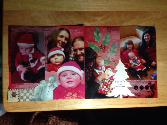
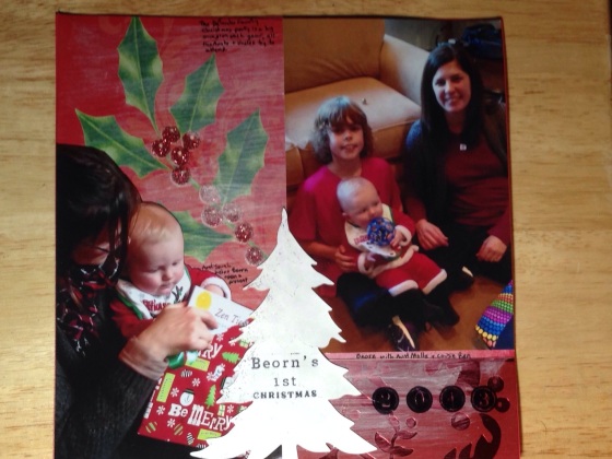
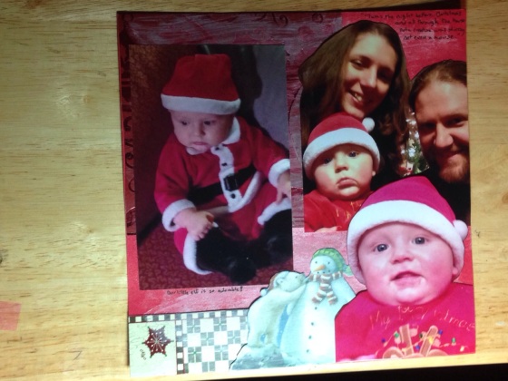
So my second “A is for” thought was of a John Lithgow kid’s rendition of “A you’re Adorable”, and who is my little charming cutie these days? My little boy, of course! I just had holiday pictures printed out, so it’s high time to make a 6×6 scrapbook spread for my son’s baby book.

My other little idea was that I wanted to use some of this season’s received holiday cards in the background. I tried to tie it all together and push the bold cards into the background with some gesso and a little Perfect Pearls for shimmer.

20140126-225122.jpg

Ingredients: Reused holiday cards, gesso, Perfect Pearls, Distress marker, Sizzix Christmas tree die, Distress Stickles, Martha Stewart letter stamps, Micron pen

20140126-225207.jpg

Learning: This was my first experiment with gesso, and I really like the translucent coverage. I’m not the most experienced with scrapbooking, but I think this went better than some of the previous ones I have done. I think doing a two page spread was a good idea, giving me 12×6 to work with, so I will definitely try that again. 6×6 is pretty tiny, but it’s for a baby book and I want little hands to be able to hold it in a few years. Also, I need to work on my photo setup for large scrapbook pages and spreads!

Loving: I’m happy with how the photos look fussy cut. I really enjoyed giving some of the holiday cards a second life. I think the gesso really pulled everything together, and made a great surface for writing on. And of course, being sentimental, I really love seeing my baby’s great pictures! He is the most adorable in my eyes!

20140126-225241.jpg

1

Tropical blue

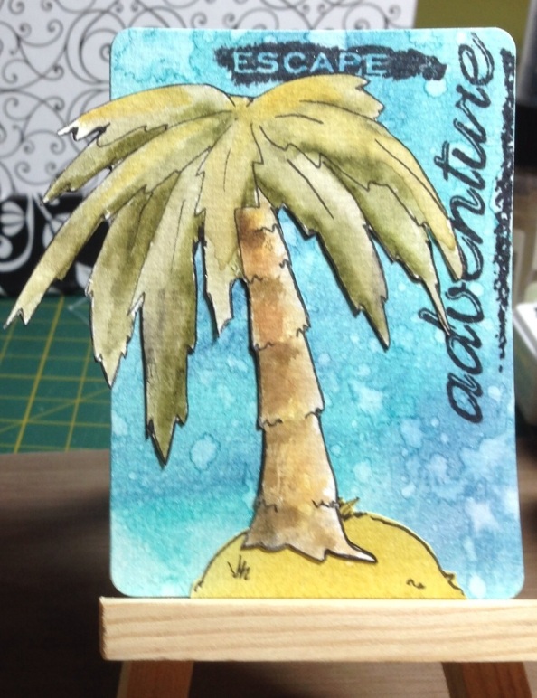
A while back, my group of work friends decided that we should bring back magnets as souvenirs whenever one of us went on a cool vacation. Just something to bring a little fun decoration to the ubiquitous metal filing cabinet. Since I had a baby over the summer, vacations aren’t really on my horizon for a little while. So I’ve had in mind making my own cool artsy magnets for my friends.

At first the question was format. The tag dies that I have are pretty small, so I decided an Artist Trading Card (ATC) would be a good size. I picked up some watercolor paper recently, thinking that might be a preferable medium for using Distress inks.

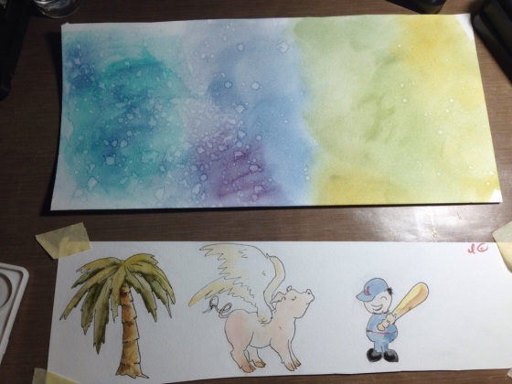
I started by doing some drawings, first in pencil, then in Micron. I don’t think of myself as much of a line art illustrator, my preferred drawing style is more about realistic shading, but sometimes I surprise myself with some decent cartooning. Maybe I’m getting better as I get older, or maybe I’m just starting to accept that my style is somehow cutesier than I intend!  Whichever it is, I think these came out really great! I colored them with distress inks (using a paintbrush on the stamp pad) and distress markers.

After that, I started inking up the background in zones of color, and sprinkling with water.

20140107-225756.jpg

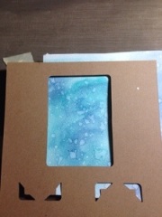
I used the outside of a previously cut ATC as kind of a viewfinder to decide just where to die cut my four cards.  After I cut apart the four sections, but before I die cut, I used Perfect Pearls mist to add a bit of glimmer (I don’t think you can tell from the photos).

20140107-230334.jpg

I fussy cut my three drawings (the fourth friend’s card was based on a stamped sentiment rather than a “favorite thing” drawing). Then I inked along the cut edges with the side of the brush end of a black distress marker to take care of any imperfect cutting. Do other people do that? I know some people leave a stylish white border, but I felt like that wasn’t really me. I can’t be the only person to black ink the edges, but I haven’t seen other people mention it.

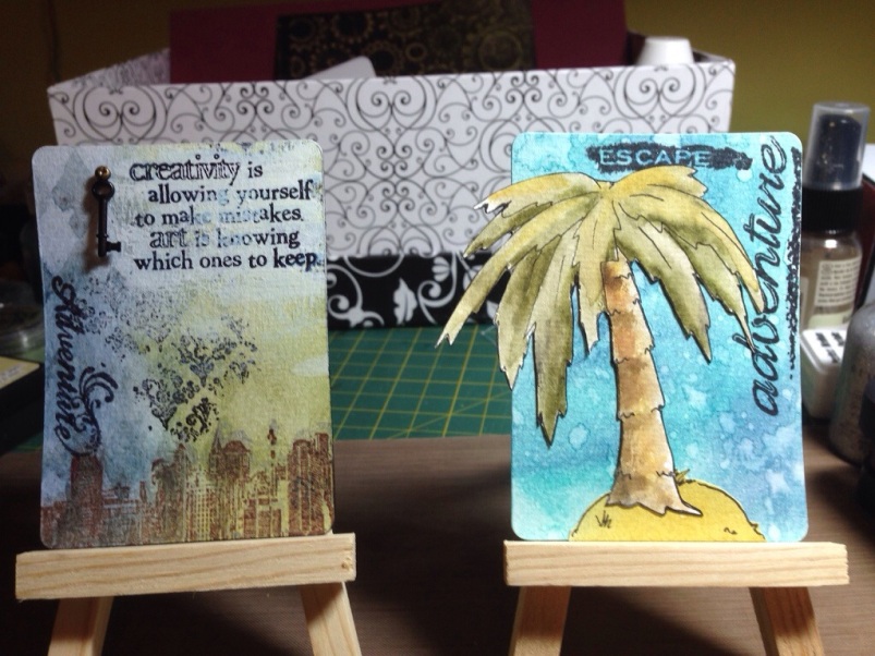
The rest was a matter of stamping and gluing. I put magnetic strips on the back when all else was finished. And there we have it, four ATC magnets!

Ingredients:    Watercolor paper, Distress ink pads, Distress markers, Archival ink, Micron pen (liner), white acrylic paint, Harlequin Tim Holtz layering stamp, Perfect Pearls mist, tiny key from 7 gypsies, fastener/brad from Tim Holtz

Stamps from: Tim Holtz Visual Artistry City Central (creativity sentiment, cityscape, stars), Scrappy Cat (travel/adventure sentiments) , Flourishes (flowers, distressed flourish pattern and “be happy” sentiment), Bo Bunny (French background text)

20140107-231258.jpg

Learning:  After doing such a vast quantity of holiday cards in such a short time, it was really refreshing to tackle something with more creative freedom.  I really enjoyed trying to capture my friends’ interests in a tiny art card.  I feel that using the watercolor paper was a big breakthrough since I have been gravitating towards wet techniques.  I love a good Clean & Simple card, but for non-card applications I am really enjoying the texture that can be achieved by layering inks, water, mists, dry-brushed paints, stamps, and so forth.  I feel like I am still finding my paper-crafting voice, but I think that this project has taken me a long way towards refining my style.

20140107-231311.jpg

Loving:  I really feel like this project made a lot of things “click” for me!  I can’t wait to do more artsy ATCs, they are such a fun size!  Also, I feel like for the first time, I got some of these cool Tim Holtz techniques to really work for me.  I really enjoyed the watercoloring with the Distress inks and markers.  I just loved watching the colors come together!

20140107-231319.jpg

Challenge:  Because of how well the beautiful blues turned out in my tropical vacation ATC, I feel compelled to enter this one in the “Blues” Challenge at the Simon Says Stamp Monday Challenge blog.  I loved looking at all the design team inspiration, because blue is my favorite color!!  This one is for a coworker who plans great vacations like a skilled travel agent.  I feel like I really nailed that tropical turquoise blue.  I hope it inspires her to dream of the next great destination!

1

Dotty with joy

For the last card project, I had some kind of weird gluing accident. The glue made the paper translucent and blotchy where it dried. Then I tried to correct it with some distressing, but it made a total mess of the pattern.

20131215-105433.jpgCue sad music.

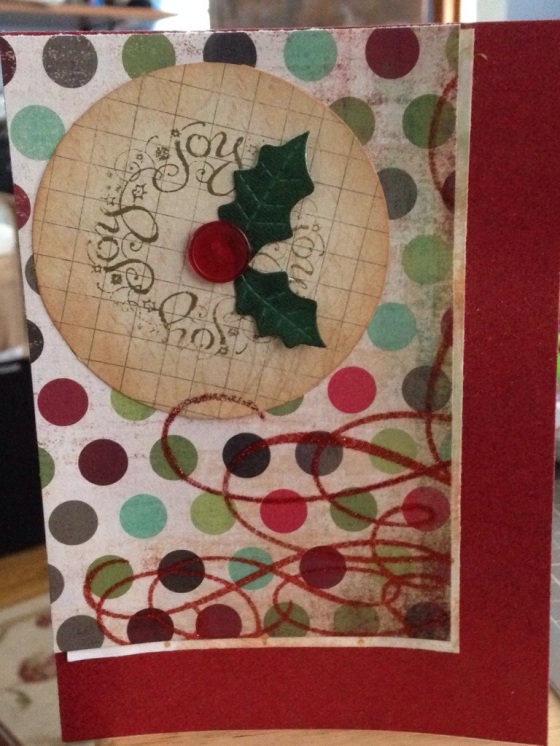
Waste not want not – I used this botched card front as the base for today’s card for the Shabby Tea Room challenge using polka dots and buttons. The inspiration photo had an adorable button tree, but I wasn’t feeling that ambitious, so I did button mistletoe instead.

20131215-105749.jpg

I cut the circle with a rotary circle tool, but it made me want to get nested circle dies, it was kind of fiddly.

Ingredients: My Minds Eye Lost & Found Christmas paper, David Tutera A7 glitter card, Sizzix sizzles mistletoe die, red button from stash, Distress inks, glitter glue

Learning: This project went pretty well. The main issues I had were that the rotary cutter pin would widen the hole in the paper causing slippage. Next time I will tape my paper down and that should prevent the need to trim afterwards.

Loving: I love that I rescued a failed project. I also think the button is pretty cute for mistletoe!

2

Time to send some cards

I’m afraid to ask what the deadline is to send cards internationally for Christmas. I suspect it’s already passed. So today I promised myself I would finish the final card for a geeky gamer’s card swap for which I promised ten cards this year. I’ll send them tomorrow on my lunch break. I used the fun sketch from Flourishes’ December release challenge to inspire me.

I’m quite excited to see the whole Flourishes December release. Being new to the world of cling stamps, there are a couple of companies that I have started following avidly, but Flourishes so far is the only one I’ve purchased from. In their last release of three designs, I was lucky enough to win one set. I liked the quality enough to buy another set from the November release as well as a couple of their holiday designs, and the third set is waiting in my wish list for a reasonable excuse to justify another craft splurge!

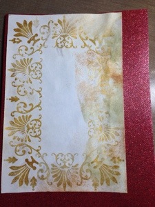
Anyway, I digress from tonight’s card. My initial plan was to use some of weird border stamps from my stash along with perfect pearls gold for the “sandwich filling” layer. After a great deal of careful work on this sandwich layer, something went terribly wrong in gluing that layer on to the background. The glue dried but left the paper blotchy and translucent. That glue has never done that before, I can only guess that it was because my craft room was chilly. I tried to age the paper with Distress inks, but it pulled off the perfect pearls making everything worse. So I set that one aside and tried again.

20131212-235725.jpg

Ingredients: David Tutera A7 Celebrations card, Recollections ribbon, My Minds Eye Lost & Found Christmas paper, I can’t recall who made the punch

Learning After the mess of the first attempt, I got a bit hasty with the top layer on this second attempt. I feel I should have background stamped it or something.

Loving: Of all the cards where I included a little gamer/geek motif, I think this is my favorite. I think it coordinates with and showcases the geeky bit nicely, whereas the previous cards mostly tried to work in the geeky in a less noticeable way. It’s a dragon drawing by Tolkien, in case you are wondering.

0

Bubble wrap snow storm

The Simon Says Stamp Wednesday challenge this week was “Make your own Background“. The toughest part for me was deciding which of the many techniques I have seen to try first!

I decided to satisfy my old printmaking jones and break out the brayer.

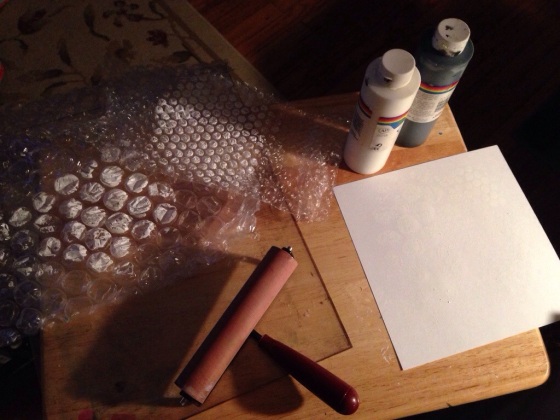
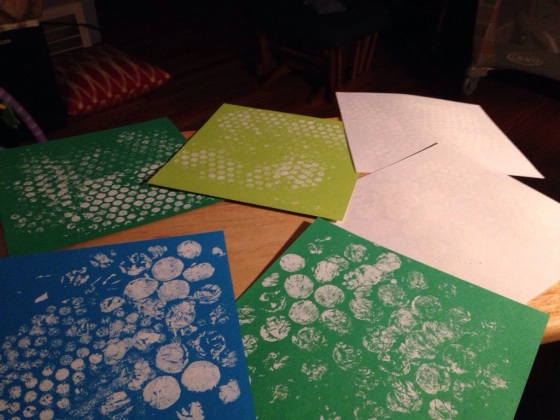
20131210-230109.jpgWhen I was in college, I took a bunch of printmaking classes and loved it! Sadly, the techniques I was best at require a lot of huge equipment that I knew it was unlikely I would ever have space for – print presses are huge! So I’m always looking for ways to bring a little taste of printing home.

So I had a lot of fun making some monoprints that should make cool backgrounds. All I did was use a brayer (it’s a rubber roller with a handle) to roll out basic white craft paint. Then I pressed different sizes of bubble wrap into the paint and dabbed them onto my papers.

20131210-230427.jpg

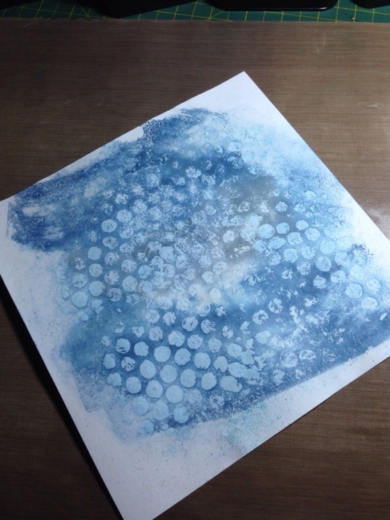
For this card, I decided to go a step further, and use the paint as a resist for some Distress ink. So when the white on white bubble wrap print was dry, I inked my craft sheet with Weathered wood and Faded jeans, spritzed the ink with water, and pressed the paper into the result.

20131210-230836.jpg I blended in a little more ink with a blending tool to even out the ink texture a little.

After the inking, I dried the paper with a heat gun, but the paper was pretty warped, so I pressed it with my household iron on a low setting. Is that normal? Do other people working with wet inky techniques press their work, or is there a different technique or paper I should try?

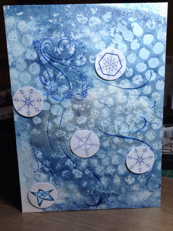
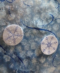
All that was left to do after that was to embellish my snowy background a little. I stamped a gusty wind, glued on some 1-inch circle snowflakes that I designed in Illustrator for a different project, glued on my geeky gamer symbol (it’s a symbol of protection from a game called Arkham Horror), drew in some more gust lines, and coated my circles in a thin layer of Stickles.

Ingredients: solid card stock papers, acrylic craft paint, bubble wrap, brayer and plexiglass (for rolling out the paint), Stickles, Zig pen, Distress inks, Inkadinkado stamp

Learning: I used my new techniques for getting a better impression from acrylic stamps, and I still don’t love the results. I even test stamped on a scrap of my background paper, and it just looked much less even on the final version. This time though the strong texture of the paper might have been the issue. I think my scrap was less textured being closer to the edge.

Loving: It was a ton of fun to print my own background with the bubble wrap! I was also please with how I echoed the round shape of the bubble impressions with my 1-inch circles. And I surprised myself by successfully freehanding the extra gust lines. Sometimes I think I use stamps as a bit of a shortcut and crutch. I need to remember that I am somewhat competent at freehanding some types of things!

20131210-232946.jpg

20131210-232957.jpg

1

Counting down to the holiday

We’ve turned the corner into December and suddenly the Enterprise is on “red alert”! Christmas cards, advent calendar presents and, just a little father down the road, the presents for the actual holiday – everything is coming due in just a few weeks! Where did the time go?

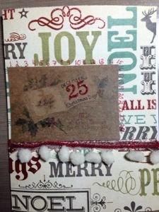
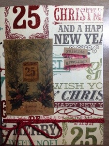
I’m trying to remind myself that there are still 24 (now almost 23) days left to enjoy crafting and holiday activities and the giddy bustle of trying to get it all done in time. So the next card, for the Simon Says Stamp Monday Challenge: “Christmas Countdown”, I have tried to focus on the “25”. But in each of these efforts, you can see the numbers of the month, counting inexorably away.

20131201-192858.jpg

20131201-192908.jpg

Ingredients: Recollections Lost & Found Christmas paper, Seasonal Kraft Resist paper, Recollections trims, Studio G red glitter glue, Distress Marker, Seasonal Chit Chat stickers

Room for Improvement: The countdown numbers could have used more panache. I hand wrote them because I don’t have a stamp for that kind of thing yet. I’m also not convinced I have yet found the best use for the Kraft Resist Seasonal paper, it’s awfully dark. Also, I discovered that glitter glue isn’t a good adhesive for yarn/string embellishments, it just gets absorbed too much and doesn’t provide adhesion.

Loved it: I did like the overall color of the Kraft paper with the colors of the background paper. I also liked how the glitter glue looked over red lettering, it really popped and looked professional!

2

Little toy soldier

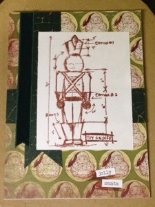
The lovely sketch challenge this week at the Simon Says Stamp Wednesday Challenge blog immediately made me think of a present. Like a wrapped gift, with the criss crossed “ribbons”. Who brings gifts? Santa does! What kind of presents does Santa bring? Toys! Or at least that’s how it works in my version of this card.

20131126-234305.jpg

Ingredients: My Mind’s Eye Lost & Found Christmas paper, Tim Holtz blueprints stamp, Ranger Archival ink in sepia, Shattered Core’dinations kraft, ribbon from Recollections, Chit Chat seasonal stickers, Distress marker

Room for improvement: I need to pick up a die or stamp set to make cute little banners. I thought about freehanding a banner, but I think what appeals to me is the formality of a banner as a designated space for titles, so I think freehand wouldn’t cut it in this case. I think that formality might be a good contrast to my otherwise informal/distressy style.

Loved it: I think the style and color of the stamping went well with the paper, but my favorite thing about this project was the sketch itself, which I can’t take credit for. I just felt like this sketch was easy to make work, and very cute and “gifty” looking.

1

A lady of mystery

There’s a lot I don’t know about my mom’s side of the family because I lost her when I was a preteen, before family history sounded interesting.

Since I’ve had my baby, I have been on a mission to dig up more info on my mom’s side to add to my son’s baby book, and then later start a more comprehensive book of family history for myself. Ancestry.com has been a big help for names, dates and places, but I often wish I had more backstory. I have a few picture from a box of my mom’s old things as well. Some are marked, and others aren’t.

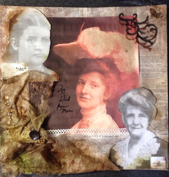
So when I saw that the challenge for the Simon Says Stamp Monday Challenge blog was “It’s a Mystery“, I immediately thought of my puzzlement over some of the photos in the box. I had posted some on Facebook and had heard back from older relatives about one. Another was marked on the back, but it was from far enough back that I wondered why someone had done a portrait photograph of the teenage girl because solo photos of children seemed a bit uncommon back then. The third was of an incredibly elegant woman, with only the inscription on the back “For Dick from Mom” to guide me. Based on the fact that the older elegant woman looks similar to the younger elegant woman, and the fact that this woman had a son named “Richard”, I’m going to guess that they are one and the same.

20131124-143903.jpg
Therefore, I believe that these three pictures are younger and older pictures of my great grandmother, and a picture of her mother as a young girl. But who knows for certain?

Ingredients: Sizzix movers & shapers flourish die, Crowded Attic Salvage stickers, rhinestones from Recollections, buttons from stash, lace from stash, Distress inks, Tattered Angels Glimmer Mists, Emboss It! Pen in black, Ranger super fine embossing powder.

Mysterious ingredient: dryer sheets

1

Gingham and grunge

This challenge comes from the Shabby Tea Room: “Gingham Country Christmas”, requiring the use of Christmas theme, gingham pattern, red, cream, and blue. For this card, I wanted to explore what happens when gingham gets a little grunged. But the problem was, I didn’t have any gingham paper, and I’m trying hard not to buy more paper at this point.

Luckily, the gingham pattern has got to be about the easiest thing to make in Illustrator, and 50% of my day job is graphic design, so I know my way around the program. It’s a quiet weekend at home with my husband working on a research paper, so it was the perfect time to make more digital papers. I say ” more” because I’ve been fooling around with digital paper ideas for over a month now. I’d ideally like to make some for sale on Etsy, but I have a lot of questions about how other people use digital papers.

This is something you can help me out with, dear readers! I’ve put up a survey over here along with a rainbow of free gingham digital papers that you can download if you wish. If you do take the survey, or leave a comment, then I thank you very much!

Back to the card:

20131124-020405.jpg

Ingredients: my own gingham papers, Distress inks, Sizzix tree die, Sizzix Movers and Shapers flourish, My Mind’s Eye Lost & Found Christmas paper, Holtz Seasonal Chitchat, rhinestone from Recollections